Saturday, November 19, 2016

OUGD504 - Studio Brief 2 - Researching Pre-existing Map Interfaces

These map applications vary and differ in different ways, one particular aspect which is strong from the macbook version of maps is the information window which opens up when a business or company is selected on the map. This includes vital information such as photos, phone number, address and reviews. A similar feature could be seen introduced for each available property in the map of my own software.


Analysing the app in comparison has shown a much simplified version for the smaller screen. Taking this into consideration is crucial to make sure that the map is not too crowded and confusing. When current location on the device is also activated, the app locks onto the users coordinates and displays this using a blue circle. Looking at other apps, this seems to be quite a universal recognised symbol for showing the location of the consumer.


Google maps has a different approach, using a slider to the left for all filtering and search criteria, this refining search option could be useful for elements such as house price, number of bedrooms etc...


Again, Uber has utilised the blue circle symbol to represent the users location within the app.


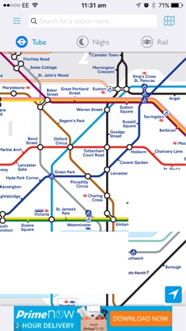
A couple of map concepts which are visually unreadable to the user are the satellite map and the train maps. The satellite is still usable however, makes the map overcomplicated to the user whereas the train map system does not use actual proportions. This is a great system for simplifying the train routes which travel over vast distances however, would not be useable when attempting to identify house locations. A separate train map could be opened within the app which shows which station is closest to the house selected but this feature is the only real use that it could produce.


No comments:

Post a Comment