The final chosen stock is a clear white 200gsm stock because of the photographic coffee table genre of the book. It was decided that the paper does not need to be darkened to an ivory as, due to its large photo content, not much of the viewers time is spent straining their eyes reading text. This decision was made in contrast with Yan Tschichold's methodologies as I personally feel that this rule is slightly outdated and also specifically made for highly typographic books with large sections of block text.

Crop marks were added to the pages in the printing which were extremely beneficial when measuring and aligning each page to be folded. The consistent grid system within the composition of the page also helped in this process. One other consideration when printing and folding was to take the grain of the page into account, this was particularly important when trimming and folding the black end pages as they were made from a thicker 300gsm paper. Without taking the grain into consideration, the end pages would have been exceedingly difficult to bend when flicking through the pages and could have also resulted in the thicker card splitting slightly around the fold.
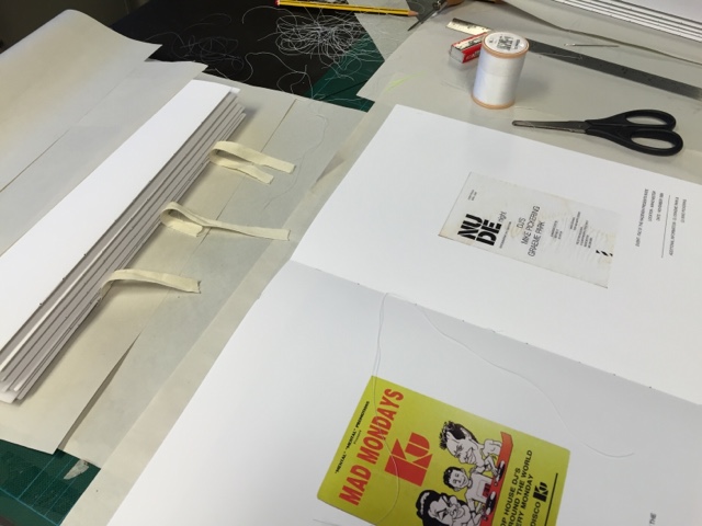
The three strips of fabric used to connect all of the page sections together have been changed to a thinner fabric as, on the mock up book, the fabric can be noticed underneath the end pages. This thinner fabric should solve this issue.
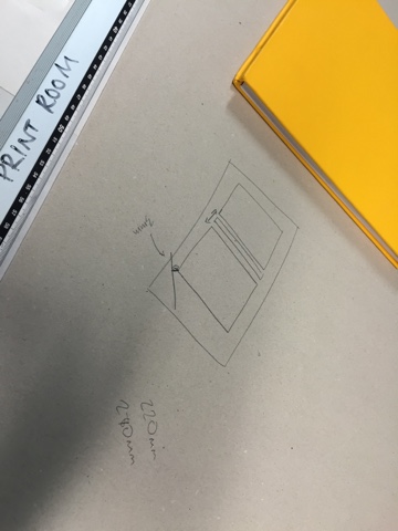
The final case design has also broken a couple more of Jan Tschichold's ideologies. For example, the flat spine of the book and the unnecessarily large design. The large layout decision was conducted by researching similar modern coffee table books and comparing how my book would look alongside these in relation to my target audience. I believe that in the 21st century, there is such a larger target audience for these books as when Tschichold wrote his rules as books (especially photographic books) have become more of an ornament display piece rather than a handheld functional product. The decision for the flat spine on the other hand, was directly impacted by my stamp printing method, as it would not be possible for me to use the flat stamp on a curved spine. I decided to prioritise text on the spine rather than the curved case method because books need to be easily identified when stacked on a bookcase or shelf.


No comments:
Post a Comment