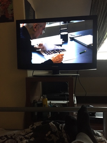
Due to the summer project and OUGD504 being based heavily around the use of typography, I felt that I should finally watch the documentary 'Helvetica' as it might help me grasp a better understanding of type as a whole. The most interesting elements from the whole documentary are its identification of the significance of Helvetica during the Modernist movement. I have personally always found Modernist design the most visually stimulating however, I found the film inspiring on explaining the transition into the postmodern era and how 'Helvetica' and other modernist design had become boring and repetitive. Looking at the postmodern era from this angle has given me a better insight on why it happened and I am personally starting to have a more neutral standpoint on which of the movements I favour. This film has not only given me the ability to further identify modernist and postmodern components in rave art and culture, it has also heavily inspired my context of practice essay as I have taken a huge interest into these two movements. For example, I am currently analysing rave art from the 1980's all the way to current times and I can see the art movement transition which designs take throughout this journey. It has given me the idea of possibly creating a publication which showcases this transition in typography as a timeline from the illegal raves in the 80's-90's to the designs in current times.


No comments:
Post a Comment