In an indoctrinated society run by the media and advertising campaigns, it can often be hard for youth to grasp an opinion on a product before being persuaded to think differently. This is especially prominent at very early stages when the brain is not yet developed enough to understand blatant marketing and propaganda. Therefore, my chosen issue seemed like a genuine problem which needed to be addressed, it seemed unbelievable that more wasn't being done to set our youth on a healthier and more prosperous path in life.
In the early stages of my project when I was still undecided on my ethical issue, I found research and planning quite misguided and unorganised. It wasn't until I took it into my own hands and rewrote the brief when my project grasped some clarity and direction. Nevertheless, these early stages of research weren't completely inapplicable to my final resolutions, they were still appropriate within the material and sustainability packaging considerations. Sustainability in general seemed too broad to take on as the focus of my ethical issue, therefore it seemed necessary for my project to naturally evolve into the packaging industry, and then to child obesity.
The demographic of the brief has been one of the main considerations throughout. I was debating for a while whether an app would be a suitable solution for children aged 2-13 until I conducted an interview with a nursery nurse. It was pointed out that technology is being used in educational aid from children as young as 2. These are mainly through the use of iPads with puzzles, colour games and interactive stories. It was also researched that lower income areas are where the problem of obesity is most prominent amongst children and therefore it was determined that this is where my project could be most applicable. It is important for the child to want to eat the food they are presented with and therefore they must be targeted as the main demographic.
Not every child will use iPhones or iPads however, therefore it was deemed necessary to include cross media distribution with the use of physical fruit stickers and posters to make the product just as engaging without the app.
Overall, the module has been a great opportunity to use my creative skills positively for the benefit of others. I hope that I can conduct many of these project throughout my career as knowing my work is making a positive change to the world would be the most rewarding factor. It was also productive in a practical sense, I got to engage with processes and skills which I had never used before and needed to be developed. Screen printing within the traditional print brief is a skill which I have always wanted to learn and this module has given me the opportunity to add it to my arsenal of creative assets as a practitioner. I see myself becoming more conceptual as the year has developed and have started to think broader than just graphic design. I hope that I can carry this across into level 6 and tackle briefs which are unique and allow me to be as creative and imaginative as possible.
Wednesday, May 17, 2017


OUGD505 - Studio Brief 2 - Range
A range of products has been designed for different fruit variations, this spans not only across the fruit products themselves, but also across a range of digital and physical formats.
The product has been expanded across;
The product has been expanded across;
- Posters
- Banners
- Billboards
- Fruit Stands
- Hole in the Wall
- Social Media Hashtag & Campaign
- Physical Teddies & Rewards
- Augmented Reality App
- Fruit Stickers
The vast range of characters was also ubiquitous to genders and therefore appeals to both male and female target audience.


Tuesday, May 16, 2017
OUGD505 - Studio Brief 2 - Distribution

The fruit with stickers attached discussed in the blog post OUGD505 - Studio Brief 2 - Fruit Sticker Concept & Experimentation will be distributed to large supermarkets inside boxes much like the prototype below.

They will then be displayed in colourful custom stands positioned within an otherwise bland fruit and veg section. Accompanying promotional material for the store may include poster advertisements, tote bags, a hole in the wall photo board and a social media presence.


Monday, May 15, 2017
OUGD505 - Studio Brief 2 - Physical Figures & Rewards Scheme Concept


'Moshi Monsters' is an online game which also sells small figurines in packs. This range and relationship between the physical and the digital is a trait which I would like to adopt into my own product. This could be achieved by implementing physical figures or teddies into the rewards system structured into the app. When the user reaches their goals for eating a certain amount of fruit within a specific timeframe, they can be rewarded by sending them physical awards in the post. A similar campaign has recently been seen within the Compare the Market ads where they send out free meerkat teddies to people using their service.

OUGD505 - Studio Brief 2 - Branding & Identity


The branding and identity needed to be appropriate for my target audience therefore, simple colour schemes were used throughout the designs which not only represent the colours of different fruit (banana, apple, orange, blueberry) but also make the brand stand out in in the fruit and veg section of supermarkets. After conducting research inside supermarkets, it is apparent that the fruit and veg section can look quite bland compared to the sweets isle. Therefore, it was deemed imperative that bright colour must be added to the designs, this will draw children to it when out shopping with their parents.
The designs started hand rendered, which was then transferred into software to be rendered. The digital outcomes are a mixture of stencil fonts and type drawing using a Wacom Tablet.

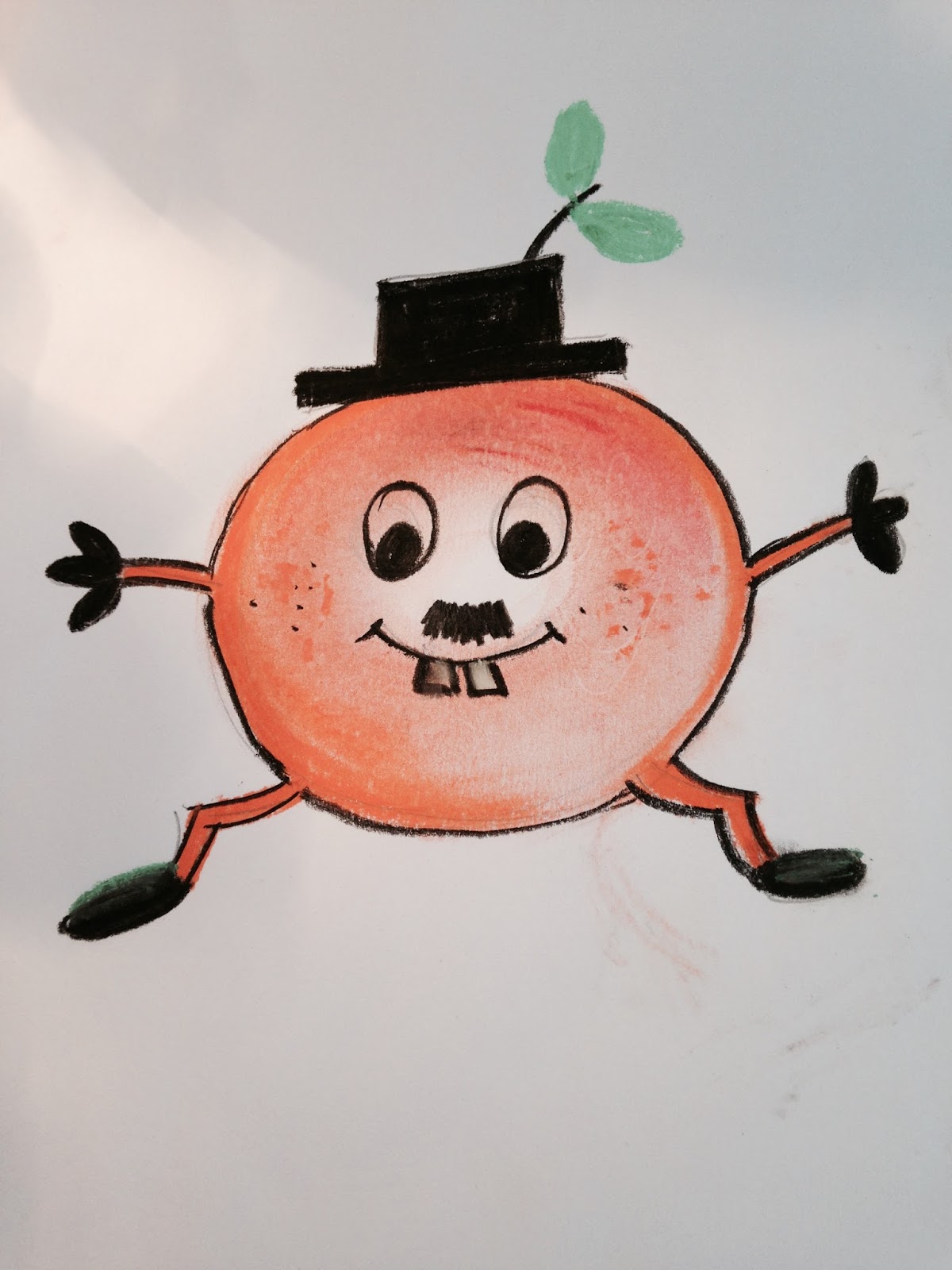
OUGD505 - Studio Brief 2 - Digital Illustrations
Following on from my initial simple sketches, a unique illustrative style has been decided upon with more clean and composed sketches being drawn ready to scan in and digitally illustrate. A distinct style was imperative for as these characters will form more of the brand identity than the actual logo. It needed to be noticeable and different to other character illustrations currency on the market.


Name consideration uses easy syllables and phrases which young children already use such as granny or nana.


A mixture of Illustrator and Photoshop was used in the digitalisation process with a Wacom Tablet aiding with the production. The background was also based around my previous sketches in the blog post OUGD505 - Studio Brief 2 - Advertising Background Designs

OUGD505 - Learning ILO's Reflection & Analysis
- Distribution, innovative and creative methods to get my concept out there
- Audience, where they are who they are what things they engage with
- Why are they my specific audience, what makes them emotional? what grabs their attention?
- Understand the potential and limitations of technology
- Valuative understanding of opportunities and barriers or restrictions
- Analyse and critically evaluate the social, political and ethical problems within my issue, research into the subject matter and how it is a social context. How it relates to the public.
- Be objective, analyse it from various different positions
- Acknowledge the opposing opinions
- How the research relates to my chosen outcome
- Explore and apply a range of appropriate responses
- The method of my graphic design
- Where I go from the brief and how it becomes a final product range and distribution
- How the product will be distributed and promoted
- Practical outcomes
- Conceptual outcomes
- Self determined ideas and proposals
- Do professional work with value and which reflects my progression as a designer
- Technically competent, is this appropriate? is this good?
- Clinical and clean finish
- Using the appropriate software at the right time
- Project management skills
- Time management
- Reflection, Feedback, Evaluation
- Making use of workshop areas
- Engaging with studio activities
- Thinking about some of the talks in studio
Sunday, May 14, 2017
OUGD505 - Studio Brief 2 - Wireframing


Following on from the augmented reality app concept in the blog post OUGD505 - Studio Brief 2 - Augmented Reality App Concept, sketched wireframes have been structured to grasp an understanding of how the app will work once it is developed digitally.
The app would work with a rewards system to keep children engaged, this would award digital assets, vouchers and physical merchandise as the children progress and meet targets set by the app.
OUGD505 - Studio Brief 2 - Head in a Hole Concept

Idea inspiration from this concept has formed from young memories of Blackpool Pleasure Beach. As a child these were an exciting experience to take part in, with new social media platforms and digital sharing capabilities, it will also help to boost publicity around the product.
The boards constructed in my own advertising campaign will feature the fruit characters themselves, allowing the children to imitate their favourite brand characters.
Saturday, May 13, 2017
OUGD505 - Studio Brief 2 - Fruit Sticker Concept & Experimentation
A more feasible concept than holding up the stalk or peel of the fruit would be to include stickers on the fruit with a QR code on the back. This way, the game could not be exploited by holding the same apple core up to the camera etc...
It would also be impossible to programme a camera to detect different fruit with current technology available. It may be possible in the future but at the moment, there are limitations set by camera recognition technology and therefore, a QR code would be a more viable concept.


OUGD505 - Studio Brief 2 - Augmented Reality App Concept
After studying current technology available within the industries, it seems that mobile applications must hold significance within the publicity of the advertising campaign. This can be distributed and achieved through social media sites, hashtags, applications, virtual reality and augmented reality.
To visualise the concept, simple digital designs have been mocked up using primary source photography. The mock up represents an augmented reality app which will bring the childrens fruit to life. This concept fulfils the brief better than any branded packaging as it is applicable to fruit in general and does not alienate any competitor brands. This app would also be more aligned with big supermarkets as they would want to sell as much of their own produce as they can. By advertising this app in store, they would effectively be advertising their own produce which they would receive full profits from instead of stocking someone else brand of fruit where they would only take a cut of the profit.

To visualise the concept, simple digital designs have been mocked up using primary source photography. The mock up represents an augmented reality app which will bring the childrens fruit to life. This concept fulfils the brief better than any branded packaging as it is applicable to fruit in general and does not alienate any competitor brands. This app would also be more aligned with big supermarkets as they would want to sell as much of their own produce as they can. By advertising this app in store, they would effectively be advertising their own produce which they would receive full profits from instead of stocking someone else brand of fruit where they would only take a cut of the profit.

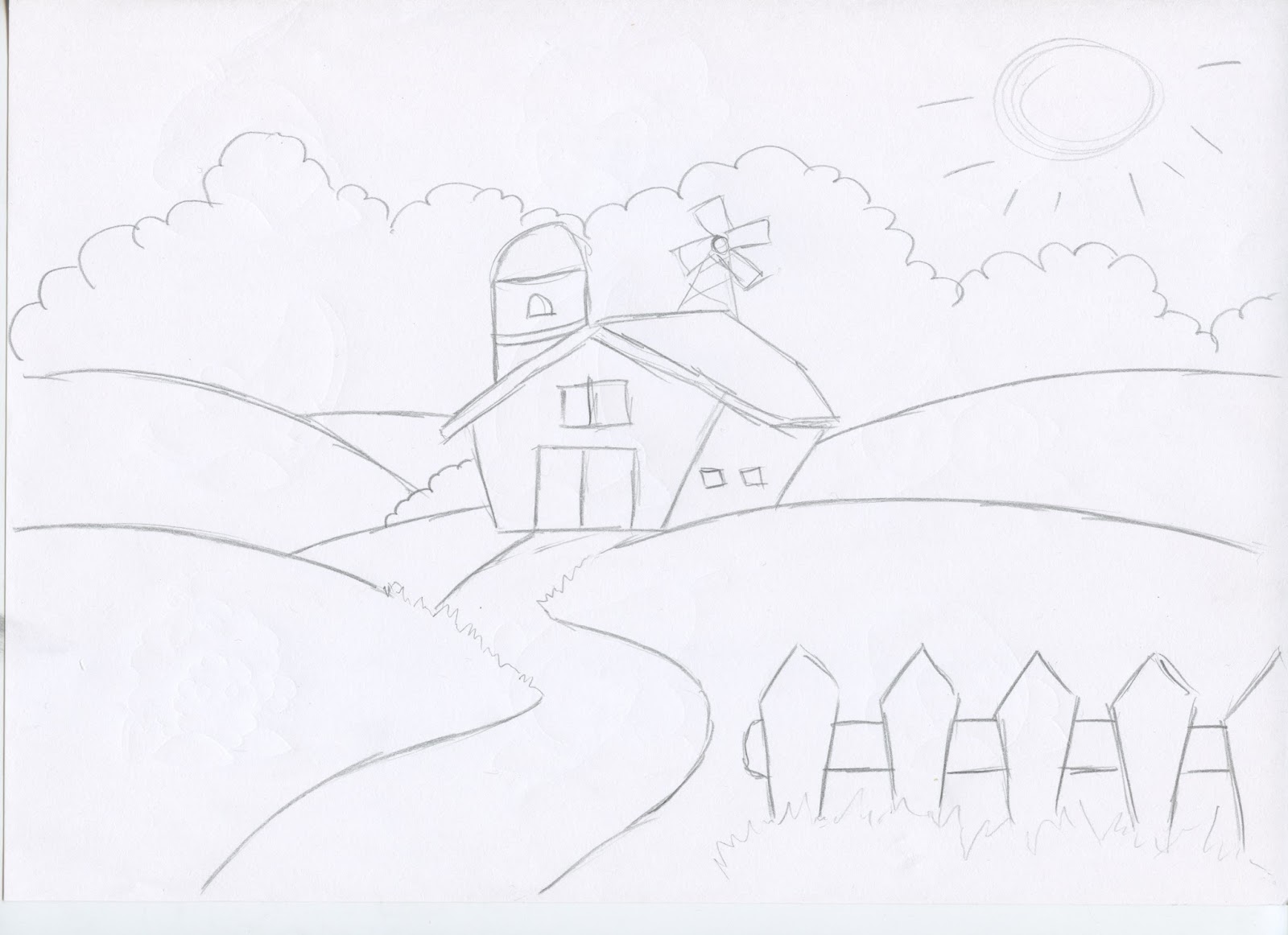
OUGD505 - Studio Brief 2 - Advertising Background Designs
Simple sketches were drawn as concepts for the advertising banner which may be produced to showcase the characters. This banner may be viewed by the public via billboards, social media sites and the fruit stand itself.


Friday, May 12, 2017
OUGD505 - Studio Brief 2 - Critique Session Feedback
Notes from final group critique session:
- Social element to the game
- Set goals, you shouldn’t go over a certain amount of fruit as it may be bad for the child
- Stickers for the apple on the character
- Sicker with code on the back
- Appeal to the parent
- Scan as you go round
- Mock up hanging above the fruit section
- Mock up on the floor
- Physical merchandise
- Unique and rare fruit rewards eg, Pommegranate, Guava
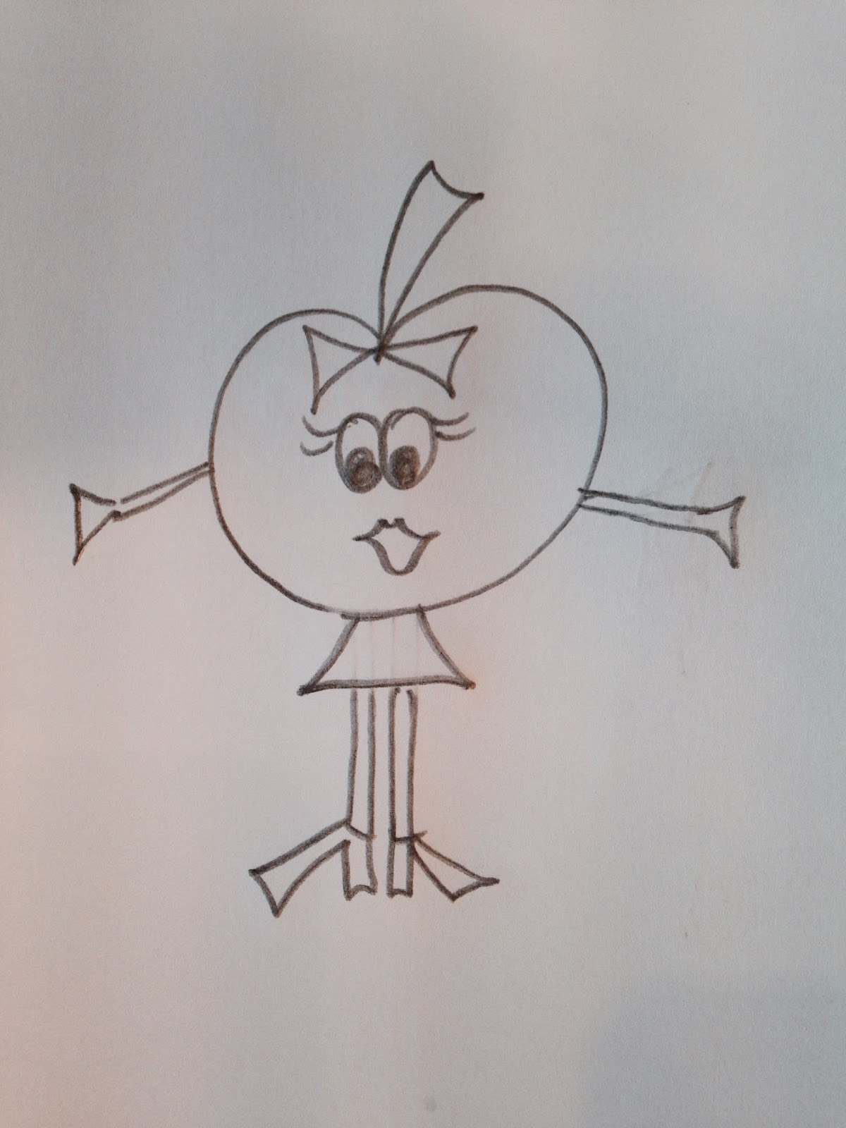
OUGD505 - Studio Brief 2 - Hand Rendered Illustration & Character Design
Simple character illustrations were conducted utilising a multitude of different production techniques such as pastel, pen, pencil and brush. This allowed for greater stylistic variation and will form a base for what more defined illustrations will be based on.


Subscribe to:
Posts (Atom)