These designs have developed from my previous sketch and has been deigned in a 12 inch by 12 inch file to fit into the 12 inch vinyl design. The centre of each design is an actual vinyl label specific to each of the DJs. I am really happy in the direction which this project has been developed however, I feel there is still lots of tweaking which needs to be done to the layout of the designs. For example, The text starts to look really distorted the closer that it gets to the edges of the page, I need to experiment in different ways to resolve this issue. I am also unsure about the curved lines and the middle of the designs takes consistency away from the pages. The typesetting of each page is also extremely time consuming and hard to polish and I am afraid that it will be inconsistent across 10 pages.
Tuesday, March 29, 2016
Monday, March 28, 2016
OUGD406 - Studio Brief 2 - Sushi Stand Foiling Inspiration
I recently walked past a stand called 'Sushi Sushi' which had an intriguing mirrored pattern embossed into some wood. This then got me thinking about how i could create a similar effect using bamboo paper and foiling to replicate a similar pattern.
Sunday, March 27, 2016
OUGD404 - Studio Brief 2 - Further Sketch Development
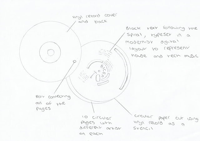
After much thought on how I should later cut the vinyl record to turn it into the shape of the square pages, I started to think about how I could flip the design and instead shape the pages of the publication to fit the vinyl record. This unique concept has really excited me however, I am not sure how the text would fit in to the design so I think that this concept needs much digital experimentation before it can start to materialise into a solid concept.
OUGD404 - Studio Brief 1 - Australian Architecture Photoshoot
Whilst in Australia, I took photographs of how grid systems are used in their architecture. There seems to be lots more modernist grid designs in Australia mainly because of the use of shading devices on the buildings, the space available and the the boost in the construction industry.
Saturday, March 26, 2016
OUGD404 - Studio Brief 2 - Music Magazine Digital Development
After evaluating my ideas and designs, I decided to produce some digital design for the music magazine. After producing digital mock ups for both the music magazine and the diversity magazine, I have decided to concentrate on producing the music magazine into my final resolution as I feel that it has a stronger concept behind it and it allows me to utilise my bookbinding workshop and use manual binding techniques.
The design has attempted to represent techno-house music by using extremely modernist typesetting and broken up text. I feel that this foreshadows a very digital, coded genre of music. The concept behind the 10 page publication is to create a top 10 up and coming tech-house DJs of 2016. I am still looking at ways to integrate this into the design as I personally feel that 'top 10's' publications can look very cheesy and unprofessional. One idea is to leave the title 'Top 10 DJ's of 2016' out of the cover of the design to create an ambiguous book casing that intrigues the viewer to open the book.
The designs below are some other possible variations to use or develop
OUGD406 - Studio Brief 2 - Documentary Inspiration
After watching the 'Myth Hunters - The Shoguns Lost Treasure', I discovered that old buddhist and Japanese monks were usually payed in rice instead of gold coins. The documentary concluded by stating that the lost Japanese treasure probably didn't exist as the Monks and Shoguns back then did not use coins for currency and instead used rice. This could be transferred into my currency by using rice paper to honour the traditional historical currency system. It could also be a good material for production methods as there is lots of spare rice available in these countries if the buddhist currency was to go into mass production by the monks.
Thursday, March 24, 2016
OUGD404 - Studio Brief 1 - Digital Layout Experimentation
I am currently playing around with my photography from Leeds and different effects which can be achieved using multiple photoshop techniques to create a consistent design.
Wednesday, March 23, 2016
OUGD406 - Studio Brief 2 - Traditional Japanese Brush Pen Lettering
I wanted to experiment with other authentic ways to print type onto my currency. One way was to simply draw the letters on manually. To do this I bought a traditional Japanese Brush pen to experiment with brush pen calligraphy and practice writing Chinese and Thai typography. I have then used techniques from my photography lighting induction in order to photograph the finished type.
 |
| First Attempts |
OUGD406 - Studio Brief 2 - Primary Research
Whilst in Qatar Airport, I came across this traditional Chinese stand which had some very interesting authentic pattern designs which could possibly be implemented into my currency design concepts.
It also used gold paint which has inspired me to look into possible screen printing metallic inks and foiling methods.
It also used gold paint which has inspired me to look into possible screen printing metallic inks and foiling methods.
Tuesday, March 22, 2016
OUGD406 - Studio Brief 2 - Primary Source Foreign Note Research
Going through the airport, I was given some Dirhams from Dubai, and some Riyals from Qatar as change. Even though these notes are arabic, the typography and traditional layout still holds similar connotations to traditional Chinese & Thai Buddhist Currency which I could possibly use for inspiration.
Monday, March 21, 2016
OUGD406 - Studio Brief 2 - Design Sketches
I have used my Buddhist Symbol Research and various material influences from tutors and peers to influence my design sketches. Lots of my other research such as the Sushi Roll Mat research and Django Film research has also been used as inspiration when designing concepts.
OUGD404 - Studio Brief 1 - Clouds Photoshoot
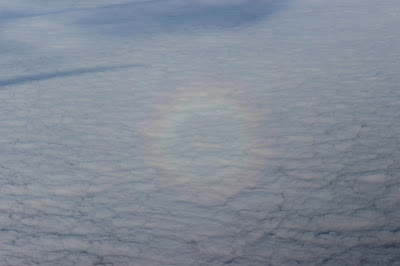
I have taken the photoshoot from above the clouds which I had planned with the colour theory publication design. Some of the images even have the natural colour spectrum circular rainbow on them which could be a really interesting way to represent the colour theory publication if I were to follow this route.
Subscribe to:
Posts (Atom)


