Through no intention, I have found myself becoming more manual and conceptual throughout this all of the briefs in OUGD406. Every brief has been equally as experimental as the last thinking about the context behind the visual form of communication along with desired target audience and the media used. Working in this format has allowed me to create deeper final resolutions that are not just composed because the elements look nice. Each element of every project is now becoming informed by a broader range of research developing from real life experiences. I have found myself now constantly finding inspiration during my leisure time, often watching films or socialising, as my practice is now merging with my identity. When first reading a brief, development process is being taken into consideration and how I can push the brief to its limits. A piece of advice which my tutor John has given me is that if you can think of an idea, someone out there will be able to make it a reality. When first tacking a problem, this is the first thing that comes to mind, during the initial concepts stage I try to be as experimental as possible.
At the start of the year, I intended to use to colleges facilities to my advantage and set out to experiment with as many different methods and techniques as possible whilst it was at my disposal. Towards the end, I believe that I have utilised as many of these that was possible during the time period and now feel that my design practice has greatly improved with this new knowledge. Even if I don't use one of the facilities again for the rest of my time on the course, I feel that knowing these methods always gives me more opportunities to expand my concepts than someone who has no prior knowledge of the technique. My only regrets are not taking advantage of the screen printing facility as I feel this is one of the more important and technical machines. The laser cutter is also a machine that intrigues me along with motion graphics software however, throughout the summer, I am hoping to set myself some personal briefs where I can hopefully continue developing my practice off the course using online tutorials.
Friday, April 29, 2016
OUGD406 - Studio Brief 2 - Evaluation
Towards the start if this brief, I set out to re-think the whole concept of currency completely and intended to create a conceptual form of bartering unique to any other. Therefore, I started to investigate sub cultures in order to find a missing link that would hugely benefit a specific group of people. This included researching a variety of diverse groups such as Buddhists, Prison Inmates and Nightclub Attendants. The project also allowed me to explore new unique techniques and printing methods which have helped expand and benefit my emerging design practice. With the final resolution, I have attempted to create a piece which is as authentic and traditional to buddhist culture as possible by using completely manual methods and keeping the design as tactile as possible. Traditional Japanese brush pens, wax, ink, paint, rubber, fire, stamps, chisels, glue, pens and multiple handmade stocks have all been utilised in the development of my currency design to inform my final piece. Personally, I believe that this project has had the biggest underlying concept and research to date as probably 85% of all of the time spent on the project has gone into research, inspiration and experimentation. I have started to find that this way of working more conceptual has really suited me over the last couple of months and I notice that more and more of my time being spent with a pencil at the initial design stage rather than straight into digital mock ups. My only regret within this project, is that I did not have time to experiment with Sushi Roll Mats as a form of stock choice. I think this would have been truly unique to any other currency if executed perfectly.
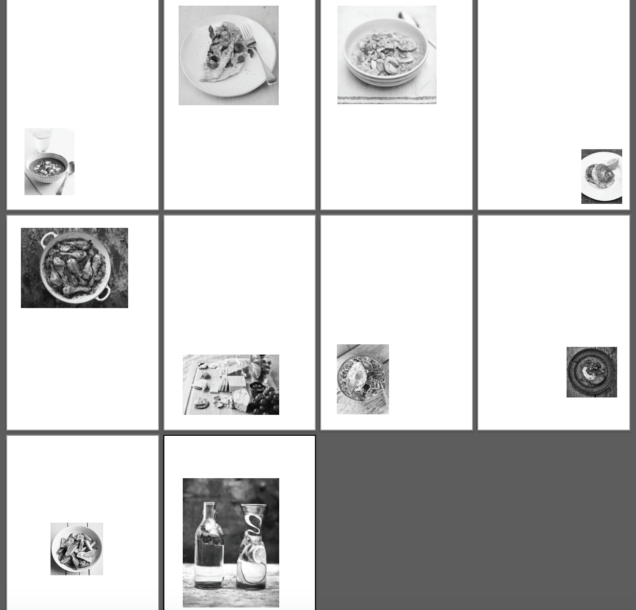
OUGD406 - Studio Brief 2 - Final Resolutions
For my final notes there are 3 divisions, 1hour, 4hour and 12hour. These are represented in buddhist type with the mayan numeric system below. I have also used two stock choices which are connected via a wax seal. The thinner stock has been plated with gold leaf to give the note a look of expense and worth. The wax seal has also been finished with a layer of gold leaf to make the markings stand out from the red wax. The typography has been applied with a traditional Japanese brush pen and then two toned with a metallic silver brush ben. The other type has been consistently applied using ink and press techniques informed by the Lino Cutter. To finish, each note has a different symbolic image drawn with fine liner, these include Japanese Koy Carp, Bamboo Sticks and Plum Blossoms.


OUGD406 - Studio Brief 3 - Evaluation
This project has been the first real attempt at collaboration with a group that I have found extremely successful, I find that as our practice grows as a class, we are more able to manage our time and communication effectively. This is probably due to feeling more comfortable around our peers than the start of the year but also all having a greater knowledge of design principles and theories in order to apply the right solution to the given problem. After a slow start to the project, the prolonged time period has helped our team develop a communication with each other which has thrived as our group has become closer and built a more developed concept. Aspects such as the contract and Facebook group chat has given our group good organisational and time management skills and I find that having a diverse group has brought multiple skill sets to our project. As a group we wanted to think about every possible element to our exhibition from the invites and who its going to be invited, down to the budget and pricing. I believe that this depth in our project is what has helped us progress to being in the final 4 possible choices. As we have not given our speech to First Direct, I cannot give a full evaluation to how the full project has gone however, we are making good progress towards our final presentation with multiple test pieces and samples being printed and made.
OUGD406 - Studio Brief 3 - Printed Acetate Sample
The group has taken our half tone window cover concept and created samples by printing onto acetate.


OUGD406 - Studio Brief 3 - List of Invites
I have started to mock up a list of people to invite to our exhibition to gain publicity.

Yorkshire Evening Post
No 1 Leeds;
26 Whitehall Road; Leeds; West
Yorkshire; LS12 1BE; England; 0113 243 2701
Leeds City College (Art Courses)
Park Lane Campus, Park Ln, Leeds LS3 1AA
Leeds Beckett University (Art Courses)
Leeds LS1 3HE
University of Leeds (Art Courses)
Leeds LS2 9JT
Manchester Met University
Sandra
Burslem Building, Manchester Metropolitan University, Lower Ormond St,
Manchester M15 6BH
University of Huddersfield
Queensgate,
Huddersfield HD1 3DH
Leeds Art Gallery
The Headrow, Leeds LS1 3AA
Leeds City Museum
Millennium Square, Leeds LS2 8BH
Leeds City Council
Leeds Museums and Galleries,
Leeds Museum Discovery Centre
Carlisle Road
Leeds
LS10 1LB

Lord Whitney Studio
Scott Hall Mills, Buslingthorpe Lane, Leeds,
LS7 2HT
B & W Studio
No reviews · Graphic Designer
2nd Floor, Castleton Mill, Castleton Cl · 0113
245 4200
Duke Studios
No, 3 Sheaf St
0113 245 9487
SNAP Design Studio
The Old Brewery, High Court
0113 880 5662
Bark & Bite Motion Graphic Design Studio
80 York Street
0113 347 0377
Punch Creative
Studio 28, Bagley Ln
0113 255 7285
Studio Raygun
30-38 Dock St
Studio BellyTimber
Aire St
0113 345 0106
2020 Perfect Vision Limited
Millshaw Park Ave
0113 272 0277
Hungry Sandwich Club
Duke Studios, 3 Sheaf St
07972 096337
Van Amstel Studios
71 Brackenwood Dr
07950 534634
Boxhead
Duke Studios, 3 Sheaf St
0113 320 1480
Refresh Interactive Ltd
Duke Studios, Munro House
07795 006135
Giles Cooke Design
Powerhouse Studios, Ground Floor, 1912 Mill,
Sunny Bank Mills,, Farsley
0113 224 8121
Teabag Studios
1-5 Springfield Mount
0113 217 7023
Thursday, April 28, 2016


OUGD406 - Studio Brief 4 - Evaluation
My interpretation of the brief looks back on my experiences of the year and attempts to display my new skills and knowledge learned outside of the university course. Throughout this past year, I have really aspired towards learning how to cook and have found that cooking has now become a huge part of my personal life. I wanted to bring through this personality and display these experiences in a way which might help new emerging students. I have evaluated the brief as though I am trying to teach my past self skills which I have learned this year outside of my university course. The best way to do this was to showcase these skills in a cookbook.
After researching many primary and secondary source cookbooks, I realised that I wanted to create something that stands out from its competitors that represents student living. Therefore, I looked at manual methods of printing and book design in order to create a more hands on tactile recipe book. Most other cooking books are clean and finished however, mine has attempted to represent healthy living whilst also looking shabby and budgeted. A polished slick book design would have looked too expensive and classy for my desired target audience and therefore, a traditional printed cookery book was ruled out towards the start towards the start of the project.
My only regrets from this project have been that I did not have the time to experiment with the pen printer due to the timescale of the brief. Having said that, the prints are still in co-ordinence with the handcrafted black & white theme of the publication, it would have just been nice to trail out the manual ways of the printer to give the book even more of a tactile aesthetic. This has also been the first time I have ever used paint in a graphic design brief as I am usually reluctant to do so as I have not painted since my fine art course in Australia almost 4 years ago. Using black & white block colours and not having to worry about colour blending helped me make the design more graphical and has allowed me to become more comfortable when using paint in my graphic design practice.
OUGD406 - Studio Brief 4 - Page Printing & Image Layout
I have printed all of the images onto my page designs as the final part of my layout composition.

OUGD406 - Studio Brief 4 - Page Design
The page deign of each page has been carefully measured out with pencil marks first and then gone over with hand written hand writing. Because I could not get into digital print until Thursday at 6pm, the printed images will have to go on top of the pages with text on. I have also used inspiration from book page numbers and included an organisational system where all of the names of the food are located down the right hand side in the same place. This way, students can flick through the pages and find the recipe their looking for easily.


OUGD406 - Studio Brief 4 - Painting Added Props
For the presentation and photography of the final book, I wanted to use props keeping in the style of the cook book. Therefore, I have painted the various props below to go along with the final cookbook as a set.


OUGD406 - Studio Brief 4 - Painting the Final Cover
Below is a test piece on my new larger stock which I am testing. The new larger stock is much easier to find spacing for the letters as on the A5 paper the 'pepper' was quite hard to fit on.


Below is the final painting on the with the hard cardboard casing with the ribbon sliced into the side. This will act as my front page for the publication.
Wednesday, April 27, 2016
OUGD406 - Studio Brief 2 - Ribbon & Scroll Experimentation
Further experimentation has used ribbon and glue to attempt to turn my bank note into a scroll. I will continue to keep testing to see if this should be included in the final resolution.


OUGD406 - Studio Brief 4 - Possible Food Names
I have come up with a series of possible food names to direct each meal towards my student target audience. All of the recipes in my cook book have also been informed by all of my primary source cook books and have been simplified down to be easier for students to understand. Certain inappropriate ingredients have also been taken out of the recipes and replaced with more suitable ones which are easily accessible for students. For example, '100mg of sauvignon blanc wine' to 'A dash of any leftover wine from weekend'

OUGD406 - Studio Brief 3 - Top 4 Feedback
I have taken some notes from tutor feedback during our exhibition proposal meeting with the top 4 remaining candidates.

Tuesday, April 26, 2016
OUGD406 - Studio Brief 2 - Mayan Numeric System Inspiration
To further symbolise the divisions of the note universally, I have found some traditional buddhist numeric systems. These could be added to the design with ink or even embossed to serve as braille.

Monday, April 25, 2016
OUGD406 - Studio Brief 4 - Larger Notebook Design
After trails on the A5 paper, I have realised that the pages are too small to fit all of the ingredients, methods and images onto. Therefore, I have opted for a larger A4 paper for my book design. I also wanted the book to resemble students as much as possible so I have used a notebook appeal to not look too expensive and also to represent notebooks at university.


OUGD406 - Studio Brief 2 - Lino Cutter Development
I am currently developing my Lino Cutter concept and experimenting on my chosen stock below. I have found that the design is tricky to get clean onto my rough stock however, I am looking at ways to solve this and possible other solutions.


OUGD406 - Studio Brief 1 - Secret 7 - Evaluation & Extended Final Resolutions
This professional brief has been the first brief where I have really re-evaluated the direction of my brief due to having a large body of distinct design ideas. At the start of the project, I had an idea straight away and intended to produce the concept as my final resolution, it was only due to Simon urging that we had a varied design board full of around 30 distinct design ideas. However, after reviewing my final design sketches I have decided to integrate the last 2 sketches together and completely change the direction of my project. Since this point, I now understand why it is important to have a large selection of separate distinct design ideas as when you think you have reached your final idea, you could just stumble upon an even better one. This project has also been my most developed project to date as I was constantly gathering new research which was informing my design further and further. My final resolutions were completely different and bespoke to any other concept I had in mind through this deep development process. Throughout the brief there has been various influenced and informed design decisions based on colour theory and multiple other design principles learned throughout COP and OUGD404. These have been evaluated and represented within my designs to give my ideas context and to represent the 7 song choices. I have also used critical thinking and evaluation to dissect each one of the songs looking at factors such as genre, gender, meaning and visual literacy in the music videos to effectively communicate each of the songs represented in my album covers. I believe that this process helps to inform the viewer on which album cover goes with each one of the songs without just guessing using each songs unique sound wave. The contextual positioning of the notebook in the final resolutions help to justify which song is which.
Some of the final resolutions however, were not as strong as I would have liked due to the short time scale of the brief. Because of this, I went back to this brief after the Secret 7 deadline had been handed in to further develop some of my responses. These new album covers are located below
The concept for 'The Less I Know The Better' was to try to catch the pages flipping over in the wind to partially hide some of the cassette and sound wave. I also wanted to bring through the female artists gender using a bed of wine bottle corks to symbolise women.
Some of the final resolutions however, were not as strong as I would have liked due to the short time scale of the brief. Because of this, I went back to this brief after the Secret 7 deadline had been handed in to further develop some of my responses. These new album covers are located below
 |
| Clearest Blue |
 |
| The Less I Know The Better |
Subscribe to:
Posts (Atom)