This traditional print project has finally allowed me to independently explore screen printing techniques, this is a skill which I have been wanting to learn for the past couple of years. This will now allow me to have even more options and possible solutions for a brief in future projects. One thing which was prominent within this learning experience is that the outcome looks completely different to the digital designed version. Therefore, plenty of time should be allocated for the experimentation stage and a variety of test prints should be conducted before moving onto the final resolutions. This was noticed after the first few prints to which an extended experimentation process was then undertaken utilising a variety of different inks and stock choices.
Along with my personal development and practice, new contacts and have been reached out to in an attempt to sell the final prints. I intend to have sold some to various events organisers, clubs and individuals who attended the event in the near future. With the celebratory poster being limited edition and embedded heavily with nostalgia, the poster can have massive sentimental value to some individuals. This noticeability will help to further my career and could lead to some valuable contacts within the design industries.
Saturday, April 29, 2017
Friday, April 28, 2017
OUGD505 - Studio Brief 1 - Mounting the Final Resolution
To finish the prints off, they have been mounted onto a foam board to give the designs stability and extra strength.

Thursday, April 27, 2017
OUGD505 - Studio Brief 1 - Glow in the Dark Ink Experimentation
Experimentation was conducted with the Night Glo ink purchased off the internet, it is hard to show on a photograph but there is a distinctive glow within the print which would make the design stand out if being advertised on the streets at night. This ink has bee used within the final resolution set of prints.


OUGD505 - Studio Brief 1 - Amount of Prints Informed by the Concept
There has been 20 of the final resolutions printed, this has been informed by the year of the event, 20 prints for Love Parade 2000. All of these prints have been signed and numbered creating a set of limited edition prints, I now intend to sell these to nightclubs around Leeds or attendees of the festival.


Wednesday, April 26, 2017
OUGD505 - Studio Brief 1 - Print Process & Experimentation
The screen printing process was conducted on a variety of different stocks using the inks previously purchased. This was the first time that I had attempted screen printing outside of the scheduled workshops so experimentation was necessary before I moved onto the final prints. This is a skill which I have wanted to learn for a few years now, the experience gained throughout this process has been crucial in my personal development of traditional printing methods.


Tuesday, April 25, 2017
OUGD505 - Studio Brief 1 - Negatives for Screenprinting
To get the quality of the screen as crisp as possible, I chose to expose it using a design which is printed on acetate instead of white paper. This helps the screen be as clean and concise as possible when it comes to the printing process.


Monday, April 24, 2017
OUGD505 - Studio Brief 1 - Time Management
Again, what has been reiterated over other modules, a physical diary is being kept up to date along with digital notifications and reminders to keep up to date with module deadlines.

Saturday, April 22, 2017
OUGD503 - Disaster Aid/Emergency Packaging - Sustainability Awards Submission
The project was also submitted to the college sustainability awards as it addresses ethical and sustainable issues throughout. This showcases the project to a wider audience and gives the outcomes more publicity.

OUGD505 - Studio Brief 1 - Specialised Supplies from Fred Aldus
Various alternate stock choices were purchased from Fred Aldus for research and experimentation. These included different weights, textures and tones of white. Foam boards were also purchased to mount the final resolution for the exhibition.


Monday, April 17, 2017
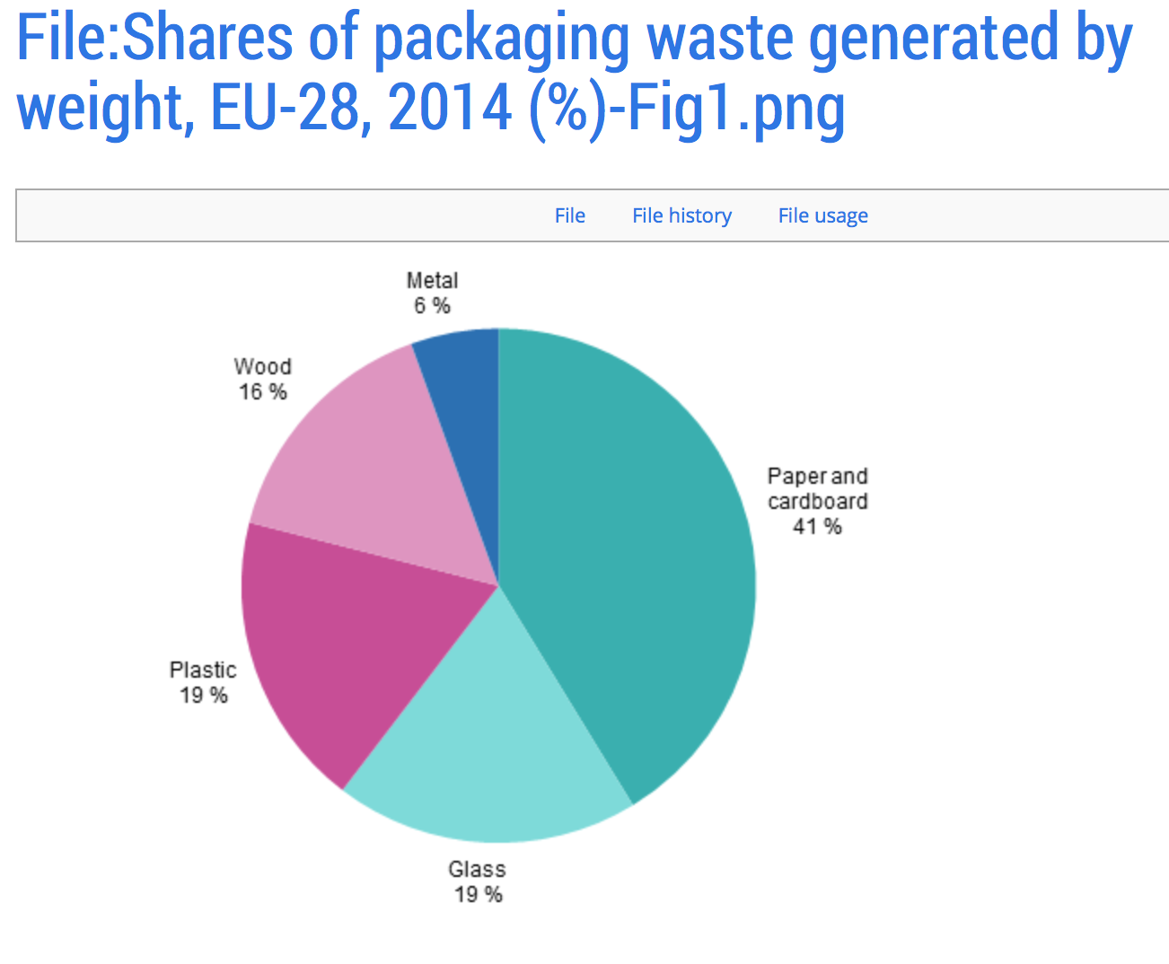
OUGD505 - Studio Brief 2 - Recycling & Packaging Waste Research
When studying food distribution, it is important to keep the packaging as sustainable as possible. Therefore, it was deemed necessary to research into recyclable materials and packaging solutions. By analysing the research, it can be seen that much of our packaging waste still goes straight to landfill, just because something is recyclable, does not mean the the public will put the waste in recycling bins. Therefore, it might be interesting to look at approaches which are easily degradable so that even if the fruit packaging goes to landfill, it will still not cause too much of a problem and will degrade quickly.
Another alternative route is to leave packaging completely and think of another way to advertise fruit to children via billboards, posters or an online campaign. This way, no extra waste product is being generated.

http://ec.europa.eu/eurostat/statistics-explained/index.php/Packaging_waste_statistics

Another alternative route is to leave packaging completely and think of another way to advertise fruit to children via billboards, posters or an online campaign. This way, no extra waste product is being generated.
http://ec.europa.eu/eurostat/statistics-explained/index.php/Packaging_waste_statistics

Friday, April 14, 2017
OUGD505 - Studio Brief 1 - Inks Purchased
Based on the halftone final digital designs, I researched the internet and visited Fred Aldus to find the most suitable screen printing inks. The final inks chosen are listed below

Tuesday, April 11, 2017
OUGD503 - Substancial Briefs - Evaluation
Both briefs, the 'Gpods' and the 'Bpods' have both revolved around modular housing solutions. Even though both briefs are designed for completely different purposes, they have both helped to inform each other when gathering research around modular housing as a whole. Before these projects I had little knowledge on how modular housing worked or in fact what it was. It was my starting concepts for one project that ended up creating 2 tangents, both solving 2 separate briefs in their own unique ways. I found it fitting that as they both evolved from one concept, they should share similarities in their names and origins.
As I am not an architecture or packing student, I feel that these two projects were brave of me to take on knowing that I would be pitched against students specialising in these fields. I also however feel that it was due to my graphic design specialism that my projects have become so unique. It allowed me to be more engaging with the judges utilising layout, composition and branding techniques. My illustrative artistic style should be a refreshing change to the majority of complicated design boards which the judges will have to go through. Most architecture students would have probably jumped straight onto designing structures and buildings on software however, I had to think differently about how I could represent my ideas and had to look elsewhere to create a concept.
My initial starting point was by looking at structures within nature as these have naturally evolved over thousands of years to perfection. Nature is where many architects get their inspiration as shapes such as the honeycomb have been naturally perfected. Within the architectural aspect of the project, it became clear that I would not be able to compete with these students if I were to design complicated structures. This lead me onto using simple shapes to build up an overarching modular structure.


-Fig4.png)
Subscribe to:
Posts (Atom)