
Saturday, December 26, 2015
Wednesday, December 16, 2015
Photography Induction
The Photography induction was a basic insight into the facility's and equipment which the photography department has to offer. We were then shown some basic rules and techniques of photography and told to test out these methods around the University. Having lots of prior experience and a strong knowledge on photography already, I wanted to display each technique in the most fitting environment for each specific type of shot. Therefore, I took my own camera around Manchester during the Christmas break. I felt that it would be much more worthwhile to display these techniques at a more applicable time of day and in a stronger location.
Slow Shutter Speed -
This shot was taken over Deansgate locks at a shutter speed of around 15 seconds. I used a tripod to capture the movement of the cars using light trails, whilst keeping the environment still. I chose to show this technique at night as in the day, there is too much external light which can make your shots too exposed when shooting at a high shutter speed.

Slow Shutter Speed - Zoom Photography
This technique was not shown in the induction however, it has always been an interest of mine due to photographers such as Jacob Wagner who create some amazing city-scape shots. This technique follows the same rules as the one above but the zoom lens on the camera is also utilized giving the effect of the lights shooting towards you like a firework. This shot was taken in the China Town area of Manchester city center to take advantage of the many bright neon lights to create a high contrast image.

I then tried to depict a representation of what different shutter speed actually looks like. To do this I have taken the four photos below on various shutter speeds without changing the placement of the camera.


Saturday, December 12, 2015
OUGD405 - Wayfinding Primary Urban Typography Research
 This brightly coloured graffiti typography found being painted in the centre of Leeds can be related with the styles of the interior designer Ben Kelly. This manual way of working creates an authentic urban appeal which could be used within my way finding system for Urban Outfitters.

Wednesday, December 9, 2015
OUGD405 - Studio Brief 1 - Wayfinding (Continued)
 |
| Headrow House |
I started to think about further ways which way finding could be applied, not just in locations but also items of clothing and in this case, records. After seeing the professional speech on Headrow House, I found the hand painted white and black lettering very industrial and urban. I could also see further links between this lettering and the typography in my blog 'OUGD405 - Urban Inspiration'. Both of these sources got me thinking about other materials which I could utilise in my way finding system. I have designed this chalk board made from slate with this inspiration in mind which has a permanent title and numbers in white paint, but the monthly top vinyl records can be changed in chalk.


This bottom design is the most appropriate as I have used the font 'Chalkduster Regular' for the editable text on the chalkboard. The other permanent lettering will be done using paint and a stencil.


After the critique session yesterday, I had some feedback which suggested that I should play around with the lighting and have backlit signs because the store is so dark. This led me onto the idea of using blue, red and yellow lighting on each floor to highlight if you were in the mens, womens or changing rooms sections of the store. The concept would probably not change all of the light bulbs on each floor as white clothing could possibly be mistaken as a different colour. I could however, use coloured LED lighting around the edges of each floor.

Tuesday, December 8, 2015
OUGD405 - Symbols - Study Task 2
I started off this study task by researching various existing Olympics pictograms on the internet which can be seen above. Then I decided that to create a truly original symbol for my chosen sport, I would look at silhouettes of people playing and use that as a basic building block to start off my inspiration. I have circled the two most inspiring outlines which then went on to be inspiration for my sketches.

I reflected this particular silhouette below and used simple line and shape tools on Photoshop to create a skeleton for my design sketches to be based on.

After these initial stages I started to list down what I could possibly include in the pictogram and sketched simple mock up ideas.


I then transferred the developed idea onto Oti Aicher's 45º pictogram grid.

The design was scanned into Adobe Illustrator and vectored into a digital pictogram shape. The shape was then transferred into Photoshop where colour schemes and further editing techniques were accomplished.


I experimented with the colour scheme for a long period of time in order to decide the best route for my final resolution. Initially, I decided on the colour blue as it has strong cold connotations with ice hockey and winter sports all together. When I added the text to the image however, I found that it did not suit the location of the olympics. I have used the colours yellow, red, orange and green as they are the colours of the Rio 2016 olympics and if more pictograms were to be created, there could be a consistent colour scheme throughout all of them.


I found that by using a black background on the pictograms, I could create a larger contrast which would help the design to stand out at a smaller scale and make the designs more legible from a further distance.

 |
| Final Design |

OUGD404 - Modernist and Post Modern Type Setting - Study Task 8
To visually represent modernist and post modern principles, I have designed two examples of compositions for the poem 'The Mouse's Tail' by Lewis Carroll. The example below complies to very modernist theories and rules, I have followed Vignelli's type size ratio in which font size is chosen in relation to the width of the column. I have also followed his strict modernist rules of left alignment, widows, orphans and rivers. I have also researched Fassett's theorem of legible line length where he implies that lines of text should only include 8-12 words on each row. A consistent 14 column grid system has also been applied to the creation of the page, I wanted to give the layout a document theme with as much of a corporate modernist aura as possible.


The second post modern composition below has attempted to be has expressive as possible, following no rules or grid system at all. I have also used scripted text which is very informal and abstract for use in a digital document. Type size has no relation and has attempted to be as playful as possible when deciding upon the layout.
I have kept both poems black and white to emphasise the differences between the two art movements.

Monday, December 7, 2015
OUGD405 - Urban Inspiration

Thursday, December 3, 2015
OUGD405 - Studio Brief 1 - Wayfinding (Continued)


I carried on designing simple sketches before I started to apply any concepts to the primary source photographs. Then, the photos were utilized to create digital mock up designs which are currently developing my concept ideas. I am looking to apply a bright colour scheme which will run through all of my way point system designs. This will help create a relationship for the viewer to be able to easily locate the signage in the store. I am also looking to take advantage of the floor space to create a point to point system which links up all of the signage and creates a Sat-Nav system. This will direct customers in the specific routes available in the store.


The designs below work well with the industrial look of the interior design however, as a way point system it could blend in and be quite hard to locate for the viewer. This is where my inspiration from Ben Kelly is starting to take hold as I am currently testing out bright colour schemes to run throughout the store.


Wednesday, December 2, 2015
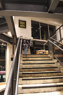
OUGD405 - Studio Brief 1 - Wayfinding - Primary Source Photographs
After looking around some industrial sights in Leeds, I found that many of the locations were outdoors or in warehouses which would not let me in to take photographs. Because of this I decided that an industrial style clothing store would be the best option for designing a way finding system as there are multiple floors and different category to label each floor such as 'Mens' and 'Womens'. I first tried to take photos in two different 'All Saints' stores however, I got kicked out of each one for taking photographs. Therefore, when I went into 'Urban Outfitters', I avoided the staff and managed to take some quality location photographs for my way finding system.


Subscribe to:
Posts (Atom)