Friday, October 30, 2015

OUGD403 - Studio Brief 2 - Typeface Design


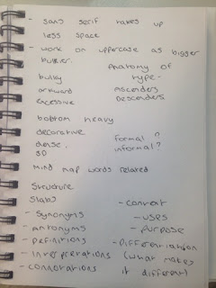
I have started this brief by getting some basic concepts of what my design could include and key words which relate to my typeface topic. I have created a simple mind map displaying this.


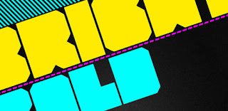
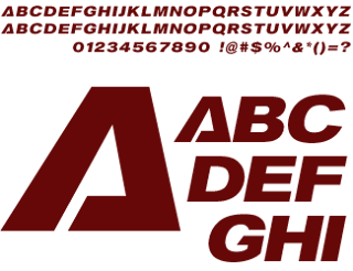
I have also collected various research of different 'Heavy' fonts for inspiration. They mostly seem to be uppercase, this is due to the fact that they are bigger, denser letter forms to work with. They also seem to have little space between kerning to create the illusion of density and all seem to be sans serif fonts.


I have also started to look at the font Helvetica ultra compressed, I feel that this font is the best starting place to design a heavy font due to its tightness and boldness.


OUGD403 - Studio Brief 2 - Manifesto Planning

As a group, we started by learning some initial aspects of manifesto design by writing one for another typeface. We have written the manifesto for 'Times' below.

Times New Roman is a Serif Monotype creation made in 1931 for The Times news paper it was commissioned by the news paper as Stanley Morrison criticized the current type saying that it was badly printed and typographically antiquated. The font was drawn and developed by Victor Lardent an employee in the advertising department of The Times news paper. People believe this typeface is based on an earlier original work by William Starling Burgess, this is controversial as The Times never credit Burgess' 1904 work as influence to there created Times typeface. There are variations of 'Times New Roman' such as Linotype made 'Times Roman', both monotype and linotype have merged but some key differences between 'Times New Roman' and 'Times Roman' such as small serifs with more of a flourish on 'Times Roman', more italic style serifs added to the letters while 'Times New Roman' are more clear and straight. Although it is no longer used by The Times, 'Times New Roman' is still frequently used in book typography and many other publications, especially because of its adoption in Microsoft products, it has become one of the most widely used typefaces in history due to its legibility and directness. 'Times' was created in between a war time period, where newsprint was powerful and seen by near enough everybody. The typeface itself has lasted the test of time in the fact that its purpose was built for physical print, but is still prominent in modern day digital design. The Times paper was and still is a strong standing and prominent paper in British Culture.


Other groups manifestos are listed below.


The typographic terminology in this manifesto sounds extremely professional and gives the reader a really strong sense of what the design accomplishes in such a small statement.


Analyzing how this is completed could be really beneficial when writing my own manifestos.


How this statement utilizes the anatomy of type when talking about Ascenders and Descenders is a really good feature of this manifesto. I should incorporate this but then expand on what emotions these letter features portray.


Explaining that the design is neutral is an effective aspect however, it should be expanded upon describing that different font weights such as light and bold portray other emotions.


Concept 1 Draft Manifesto - 

Dencity

This ornamental font is a decorative geometric sans serif typeface. It has been designed to be as dense as possible with little space between the kerning of the letters. The inspiration for the slab blueprint has been designed from city life and architecture. The font wants to break the barriers between architecture and type to see just how far a typeface can be taken into the realms of structural design. Concepts for the design include making the font into a freestanding 3D object for city advertising, this converts the font into more of a sculpture. The branding of a company will then merge to become part of the city structure rather than just a sign attached to a building. Due to the density of the letter forms , it can also be applied to the overall shape of a building using birds eye view to spell the company name. Dencity replicates the strength of bricks by using a rigid geometric design , it is bold and powerful enough to make a statement about any topic which a company demands to portray.


Concept 2 Draft Manifesto -

Newtonian

Relating with the Newtonian physics which define weight, this bold serif font has been designed to create impact whilst still keeping the professionalism of  typefaces such as 'Bodoni' or 'Garamond'. Used more effectively for dramatic headers in magazines and newspapers, Newtonian creates subtle increased differences in the stem and bowls of letter forms to portray a strong sense of importance. Used for screen documents and print, the typeface has more impactful effect on the audience when the size is drastically increased billboard dimensions.


Wednesday, October 28, 2015

OUGD403 - Study Task 3 - Drawing the Detective

For the book 'Third Girl' by Agatha Christie, I decided to look at some of the original book covers for initial inspiration and start to design some sketches. The original covers were a good starting point to understand the basic feeling and genre of the book however, as the book was published in 1966, the book designs were quite outdated. 


Because of this I had the idea of modernizing the book just like recent books such as 50 shades of grey which has had such an amazing response from young and older women alike. I wanted to appeal to a similar market and refresh the book into the 21st century.


I had the idea from the start to incorporate three of something in the design to relate to the 'Third Girl'. My first initial idea was to use negative space in between two people to show the outline of a girl however, the more I changed the outline of the two people in order to manipulate the negative space, the more unclear it was what that the outlines was people.


For this first mock up, I wanted to portray the girls presence in the book by having the title drawn on in lipstick. I used an image of a kiss mark on mans shirt to emphasize what the title was drawn on by. However, I felt that this design lacked boldness and professionalism, it was also drifting away from the 50 shades of grey target audience. It could be miss interpreted to be directed at 13-20 year old girls which is why I decided to change the title and images and only keep the header and footer of the cover.


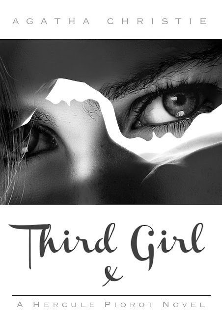
At this point I decided to move onto multiple exposure photography to modernize the design. I have selected an image of a man and a woman's silhouettes which I have then overlayed another image of a woman's eyes to represent the 'Third Girl'. I also feel that this design will appeal greatly towards the extremely large fan base of '50 Shades of Grey' which will hopefully boost sales of the re published book cover.


I have also mocked up the side and back of the book cover.


After this idea I was still certain that I wanted to relate that number 3 into the design further so i decided to go for a triptych approach. I divided a photograph into three sections however, on reflection, i'm not sure if this complicates the image too much.


I have also uploaded my design to the Guardians website.


Tuesday, October 27, 2015

OUGD404 - Colour Relativity - Study Task 2

When asked to choose my least favorite colour, I decided upon yellow. This is not due to the fact that I dislike the colour, I just feel that as a individual colour, It lacks a certain boldness about it that many other colours have and it can often fade away into the background. However, my preferences of colour vary for different situations and when integrated with other colours. For example, when yellow is mixed in a context with black, I can find that this can be one of my favorite colour combinations as it can create large amounts of contrast. My negative connotations of the colour yellow only apply when it is isolated on its own.

I feel that in the context of a children's book, yellow can be a very effective colour with lots of alternative partner colours which work well in harmony. I think that the colour scheme below can work extremely well in a very infant children's book as they are quite light and dreamy together. I believe that the colour scheme is very easy on the eye meaning that it would be perfect for a bedtime story to help the child drift off to sleep.


I have mocked up a simple colour scheme on this children's book design to put it into context.


I used the Adobe Colour Wheel and some Pantone colour charts to decide on my colour scheme.


Monday, October 26, 2015

OUGD403 - Studio Brief 1 - Logotype - Final Resolutions and Evaluation


The image below is the final resolution for Studio Brief 1. In this final image, I have stuck to the idea of using a blonde natural hair colours to represent a barbers. I also wanted to represent the brand as being as classy and royal as possible. This is why I have used various filters and effects such as 'Bevel & Emboss' and 'Inner' and 'Outer' glows to create as much of a shiny golden colour as possible. I have also studied the type which is currently on the windows and the colour scheme seems to fit perfectly.
I have gone through multiple stages of printing the design, developing it with pen, scanning the edited drawing in and vectoring the design. I feel that this repeated process was the best way of developing my type as it gave me multiple opportunity's to reflect and review each slight edited design. It also gave me a strong balance between digital and manual design which was essential in order to create an interchangeable design which could be produced digitally on screen, and manually on hand painted signs.
The roman numerals will only be added to the logo on the outside of buildings in very large scale, When at a smaller scale such as on the website, the roman numerals will be removed in order to create a clearer, more appropriate scaled design.


I plan to have a professional sign writer painting this calligraphy style logo onto the outside of the barbers as the edited concept shows below. He will be dressed in a flat cap and 1940's clothes in order to keep in theme and relate to the company itself. As the 'Gentlemen of Letters' documentary states 'People tend to usually stop in the streets and watch when any graffiti or street art is being created'. This will boost the acknowledgement and publicity of the shop. I also feel that the colour scheme is very legible with the current typeface on the windows. I think that the intricate design also creates a bespoke logo design which could become very iconic on the high street. It is quite unique and different than any other logo making it stand out among its competitors.

Another concept would be to integrate the logo on the glass of both of the windows. 


The image is displayed on the current website below. This displays the functionality of the logo and puts it into a digital concept at a small scale. The colour scheme has been slightly changed to integrate with the current website design and been changed to a 2D flat logo. The diversity of the logo is exhibited in this digital concept however, It could be shown in various other printed concepts such as business cards. This was just to get a brief idea of the logo at a very small scale.   


Class Feedback

Pros

The typography works very well with the aims i was trying to achieve. The 1940's influence works really well and the design seems to be timeless
The cuts in the mock up logo instantly communicate a barber theme
Spacing between the letters is appropriate
The hand rendered logo looks very classy, It identify s the brand identity straight away. The hand rendered flowing is very stylistic and works well on the outside of the shop
Very appropriate choice of type, definitely portrays a barber shop.
Attractive heritage feeling which is popular in  barbers these days
The design is aesthetically fitting to the interior / concept of the shop
The idea of painting the design on manually is very clever
Very formal calligraphy design
Very good kerning

Cons -

The lines striking through the type in a couple of my mock ups are too long. This would prevent the typeface being displayed in a narrow space if i were to develop this design further.
The first 'R' in the final design is slightly un legible, look into altering this issue slightly
It can be quite difficult to read at a very small scale if the design was intended to be scaled down. It could be read as 'barter barter'
The blade idea is very clever however, is it transferable to the target audience
Chosen colours was quite limited however, successfully portrayed a barber shop

Much of this feedback was praise with only a couple of criticisms. This made it quite hard to reflect on my feedback using my class feedback. The feedback which i found most beneficial was given to me by a tutor and is displayed below.


I have reflected most on the feedback behind the concept behind my idea. It would have been beneficial to base my design more around the 1940's block capital idea. This would have made my design more legible to the era which my work was based around as there are not many links between calligraphy and 1940's sign writing. I found that it was quite hard to keep my logo so closely linked with block capitals and also represent the luxury high value concept behind the business. Because of this my logo has sacrificed some of its 1940's authenticity to make the design more classy. Ideally, given more time, I would experiment with trying to keep the design as authentic as possible whilst still keeping the wealthy identity behind the company. I would of also liked to display the logo in more concepts such as engaging with the glass windows and adapting the design to more miscellaneous items and products. 


Some primary photography for the re branding is displayed below often using photography and typeface in a conjoined image.



Sunday, October 25, 2015

OUGD403 - Studio Brief 1 - Logotype - Continued


 I continued working by Creating a mock up of my second sketch in Adobe Illustrator and Photoshop. I quite liked this logo however, the tutor feedback was to concentrate on just typeface and loose all of the extra lines and symbols. I was also told to research the television programme 'Peaky Blinders' as it is based in the 1940's era. After watching a few episodes and studying the hand painted graphics, I realised that most of the old pub signs and graphics in the programme use block capitals

'The corner of Bromsgrove Street and Pershore Street in October 1957 - the ‘Stag and Pheasant’ pub, where the two constables were attacked by peaky blinders in 1895'

I took this feedback on board and decided to create a new sketch which incorporated block capitals and a more simplistic approach. I chose to place a line which cuts through the text in my logo, I have done this to relate to the slogan of the company 'Clean Cuts, Close Shaves'. I believe that this thin crisp line represents the slogan as a whole.


I also the mocked the design up digitally, I have also experimented with some various colour schemes. I have chosen to use only colours of natural coloured hair such as black, blonde, brown, ginger and grey. These colours symbolise hair and therefore, foreshadow what the company does as a profession. I have also kerned the text quite close together to again relate to 'Close Shaves'.


 I also then created some alternate designs as i thought that the line was unbalanced against the direction of the lettering. In the new design i have cut through the typeface parallel to the diagonal of the A. I have also reincorporated the roman numerals back into the design as the lines now cover where the slogan was. The roman numerals have been tracked to fit perfectly underneath the main textype.  I will possibly try to place the slogan back into the design however, at first glance, the logo looks unbalanced with the alternate text back in. It could be better to leave both the slogan and roman numerals out of the design but i am sure that further experimentation will be essential in giving me an answer.


 I have since returned back to the first sketch after attending the crit session on Wednesday and quickly getting the feedback that calligraphy could be a good way to represent the classy feel of the barbers. I also found that the Adobe Illustrator workshop was extremely helpful in mocking up the sketch as it gave me a better understanding of how to move and edit points of the pen tool. Up until this point I have mainly used the pen and path tool on Photoshop as my college did not teach Illustrator. I have replicated the sketch to form the letters 'Barber Barber' however, i feel that the design looks too repetitive so i intend to look at ways of resolving this issue. I have now printed off multiple copy's of the design at 50% opacity, I will now draw over these designs and see what variations I can come up with.


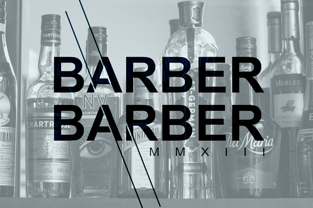
I am currently experimenting with intergrating my own primary photographs alongside some of my logo designs. Below are a couple of my edited shots from the photo shoot which i did at Barber Barber, alongside my type.


Currently, I am working on editing my digital mock up in various ways. I have printed quite a few copy's of my digital design at 50% opacity which I will then draw over in pencil and pen. I will then scan this back into the computer and continue to develop my ideas.

For the design below, I have been inspired by the curved calligraphy of an image on a Instagram site
This is a development on my first sketch..