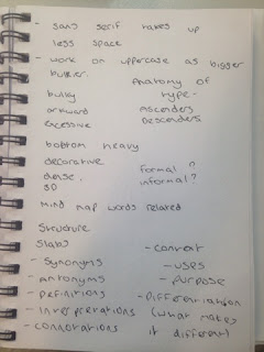
I have started this brief by getting some basic concepts of what my design could include and key words which relate to my typeface topic. I have created a simple mind map displaying this.
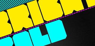
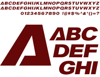
I have also collected various research of different 'Heavy' fonts for inspiration. They mostly seem to be uppercase, this is due to the fact that they are bigger, denser letter forms to work with. They also seem to have little space between kerning to create the illusion of density and all seem to be sans serif fonts.
I have also started to look at the font Helvetica ultra compressed, I feel that this font is the best starting place to design a heavy font due to its tightness and boldness.


Hi Dylan, could you identify the font on Gravity ? Tks
ReplyDelete