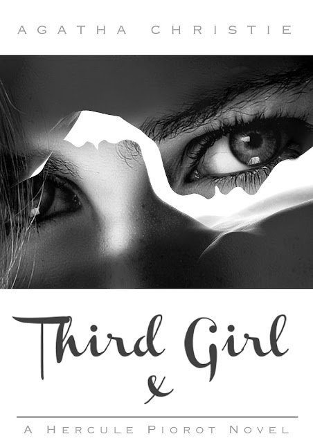
For the book 'Third Girl' by Agatha Christie, I decided to look at some of the original book covers for initial inspiration and start to design some sketches. The original covers were a good starting point to understand the basic feeling and genre of the book however, as the book was published in 1966, the book designs were quite outdated.
Because of this I had the idea of modernizing the book just like recent books such as 50 shades of grey which has had such an amazing response from young and older women alike. I wanted to appeal to a similar market and refresh the book into the 21st century.
I had the idea from the start to incorporate three of something in the design to relate to the 'Third Girl'. My first initial idea was to use negative space in between two people to show the outline of a girl however, the more I changed the outline of the two people in order to manipulate the negative space, the more unclear it was what that the outlines was people.
For this first mock up, I wanted to portray the girls presence in the book by having the title drawn on in lipstick. I used an image of a kiss mark on mans shirt to emphasize what the title was drawn on by. However, I felt that this design lacked boldness and professionalism, it was also drifting away from the 50 shades of grey target audience. It could be miss interpreted to be directed at 13-20 year old girls which is why I decided to change the title and images and only keep the header and footer of the cover.
At this point I decided to move onto multiple exposure photography to modernize the design. I have selected an image of a man and a woman's silhouettes which I have then overlayed another image of a woman's eyes to represent the 'Third Girl'. I also feel that this design will appeal greatly towards the extremely large fan base of '50 Shades of Grey' which will hopefully boost sales of the re published book cover.
I have also mocked up the side and back of the book cover.

After this idea I was still certain that I wanted to relate that number 3 into the design further so i decided to go for a triptych approach. I divided a photograph into three sections however, on reflection, i'm not sure if this complicates the image too much.
I have also uploaded my design to the Guardians website.


No comments:
Post a Comment