Metric kerning uses kerning pairs which are in built to the typeface which automatically adjusts the space between problematic pairs. Some of the examples are LA, P., To, Tu, Ty, Wa, WA, We, Wo, Ya, and Yo
Optical kerning adjusts the spacing between adjacent characters based on their shapes. It assesses the shape of a letter and decides which will be the best layout of the type.
These two are both pieces of software which have been updated over the years of digital type.
Manual kerning is much more bespoke to a brand and is the best way to space letters in a unique way.
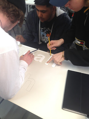
A way to help us better understand this manual method of kerning was a practical exercise called kern down. by using 5 letters, we had to rearrange them into sequences of kerned alternatives to different styles of company's.
The image below was a kerned example of a typeface for a search engine
The two above are a car company and an arts & crafts store
The next exercise was to use only 3 letters to come up with typeface branding for different company's. The examples below are different kerned alternatives for the following
Pest control company
Condom Company
Student Night Out
Luxury Car Manufacturer
Quentin Tarentino Film
Children's TV Channel
This exercise really made me understand the importance of kernig and that slight differences car represent different meanings for a company and can foreshadow what the company is. The fonts are exactly the same however, they represent different company's on opposite ends of every genre. The spacing between letters can portray a language to the viewer and can explain details about the company without the viewer consciously knowing. For example the tight kerning on the pest control company typeface can relate to how he will be working in tight conditions to exterminate the bugs, cellars, attics, floorboards and behind walls. It also portrays that the company is a tight unit and that their is no room for error and that he will exterminate all the pests. The viewer does not think about all these details straight away but their minds can automatically read the signals. If the kerning was extremely far apart then it would portray that they are very open and the pests can easily get away or run free. Without acknowledgingly thinking this, a person can be subconsciously told these ideas about a company and can be drawn away from it without even knowing why.


No comments:
Post a Comment