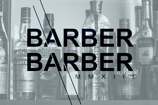
I continued working by Creating a mock up of my second sketch in Adobe Illustrator and Photoshop. I quite liked this logo however, the tutor feedback was to concentrate on just typeface and loose all of the extra lines and symbols. I was also told to research the television programme 'Peaky Blinders' as it is based in the 1940's era. After watching a few episodes and studying the hand painted graphics, I realised that most of the old pub signs and graphics in the programme use block capitals
'The corner of Bromsgrove Street and Pershore Street in October 1957 - the ‘Stag and Pheasant’ pub, where the two constables were attacked by peaky blinders in 1895'
I took this feedback on board and decided to create a new sketch which incorporated block capitals and a more simplistic approach. I chose to place a line which cuts through the text in my logo, I have done this to relate to the slogan of the company 'Clean Cuts, Close Shaves'. I believe that this thin crisp line represents the slogan as a whole.
I also then created some alternate designs as i thought that the line was unbalanced against the direction of the lettering. In the new design i have cut through the typeface parallel to the diagonal of the A. I have also reincorporated the roman numerals back into the design as the lines now cover where the slogan was. The roman numerals have been tracked to fit perfectly underneath the main textype. I will possibly try to place the slogan back into the design however, at first glance, the logo looks unbalanced with the alternate text back in. It could be better to leave both the slogan and roman numerals out of the design but i am sure that further experimentation will be essential in giving me an answer.
I have since returned back to the first sketch after attending the crit session on Wednesday and quickly getting the feedback that calligraphy could be a good way to represent the classy feel of the barbers. I also found that the Adobe Illustrator workshop was extremely helpful in mocking up the sketch as it gave me a better understanding of how to move and edit points of the pen tool. Up until this point I have mainly used the pen and path tool on Photoshop as my college did not teach Illustrator. I have replicated the sketch to form the letters 'Barber Barber' however, i feel that the design looks too repetitive so i intend to look at ways of resolving this issue. I have now printed off multiple copy's of the design at 50% opacity, I will now draw over these designs and see what variations I can come up with.
I am currently experimenting with intergrating my own primary photographs alongside some of my logo designs. Below are a couple of my edited shots from the photo shoot which i did at Barber Barber, alongside my type.
Currently, I am working on editing my digital mock up in various ways. I have printed quite a few copy's of my digital design at 50% opacity which I will then draw over in pencil and pen. I will then scan this back into the computer and continue to develop my ideas.
For the design below, I have been inspired by the curved calligraphy of an image on a Instagram site
This is a development on my first sketch..


No comments:
Post a Comment