Both digital and physical diary have been used throughout both studio brief 1 and studio brief 2. Their importance in order to meet deadlines have been instrumental to the progression and efficiency of both projects.
They have been adopted into my practice as a graphic designer and serve as a backbone in order to meet deadlines. They have been particularly helpful when recording meetings with book stores and printers outside of university; and print slots, studio bookings and workshops within college hours.
Tuesday, December 27, 2016
Saturday, December 24, 2016
OUGD504 - Studio Brief 2 - App Prototype Development
All of the page designs were taken into Adobe XD to be constructed as a working prototype. Elements such as transition times and fades were taken into consideration after taking inspiration from the blog OUGD504 - Studio Brief 2 - Researching Luxury Websites & Interface Processes
This helped to represent the app as being loyal and trustworthy with the consumer by conveying luxury and professional design aesthetics. Most of these transitions are subtle however, they help to give the application character and motion instead of being a stagnated 2 dimensional concept.
Wednesday, December 21, 2016
OUGD504 - Studio Brief 1 - Final Books & Cover Art
The printed books have just arrived from Pressision and the covers are now in the process of being printed by hand. The spine of the books have been reduced in size however, I have smaller variations of the stamp which can be used from the laser cutter process. After peer feedback, it has also been decided to leave the type on the front as it gives the smiley face print more impact and draws the viewers eye. It also creates a more ambiguous and intriguing front cover for the publication.
Tuesday, December 20, 2016
OUGD504 - Studio Brief 2 - Final Individual Interfaces
It was identified that the most important aspect of finding a house to buy, is actually locating the house. This is why a map interface was used for the home page, this eliminates the need for unneccasary steps and shows the viewer all of the houses within the area they are located. This way the viewer can simply drive or walk around the area or city they want to live in and see all houses around them. They can also toggle current location on and off and refine the location they want search from.
Monday, December 19, 2016
OUGD504 - Studio Brief 2 - Digital Design Development
After the overarching theme, colour scheme and concept of the app had been selected, the sketch designs were used as a direct template for mocking up digital versions for the rest of the app.
Many aspects within the app are informed by previously conducted research. For example, the typeface decision of Helvetica Neue has referred back to the blog posts OUGD504 - Studio Brief 2 - Production Decisions and OUGD504 - Studio Brief 2 - Considerations for Coding.
Helvetica Neue is both a web safe font and the second most used typeface on the internet, this is an indicator that it is one of the most user friendly typefaces. Using this typeface in the interface makes the interface more approachable towards the user and is ubiquitous to all languages, age groups and genders.
The blog post OUGD504 - Studio Brief 2 - Researching Pre-existing Map Interfaces indicated that the app and map needed to be simplified due to the small screen. Simplicity has been key to every aspect of the app from the iconography to the typeface, this is to keep it as user friendly and engaging as possible for the user. The different grey shade colour scheme was used to highlight the red square focal points within the app attempting to keep it as least confusing as possible.
Full bleed images of the houses once a house is selected was also informed by the blog post OUGD504 - Studio Brief 2 - Researching Professional Websites & Interface Processes where full bleed imagery within professional websites was analysed. It was decided that on an app, full bleed images will make the most of the limited space available.
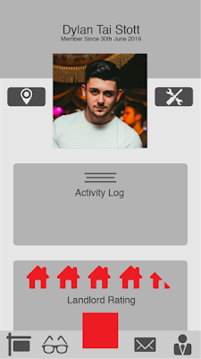
What was included within the app has all been informed by various pieces of peer feedback and primary qualitative research. Within the blog post OUGD504 - Studio Brief 2 - Primary Interviews & Qualitative Research it is suggested that covenants on the lands should be included along with planning permission details and blueprints of the house. Feedback within a few blog posts also suggested that students end up with really poor landlords. Therefore a rating system was integrate as a big part of the application.
Friday, December 16, 2016
OUGD504 - Studio Brief 1 - Pressision Printing Process
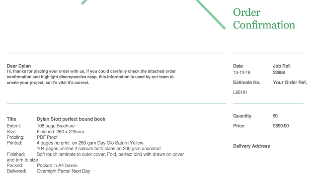
Bartering and an ongoing communication with the staff at Pressision of over 60 emails has continued to inform the design decisions of the publication. It has slightly changed the weight of stock and price of the 50 copies from the first quote to the last one. The paper weight has increased from 140gsm to 200gsm to give the publication increased thickness adding to its coffee table book aesthetic. This should have increased the price but due to an ongoing communication they have taken the price of the 50 copies down slightly.
The order has just been confirmed, paid for and final artwork confirmed. As a graphic designer with increasing knowledge of the printing process, I have done all that I can to inform how the final print is conducted. It is now undertaking the printing process and the final resolutions should be printed and delivered shortly.
OUGD504 - Studio Brief 1 - Layout & Content Extended Development
Additional development has since been made to the contents of the publication before the final print with Pressision. The block type has been edited and proof read thoroughly by a selection of different people.
The sectioning pages have also been drastically changed due to the additional price feedback from Pressision based on adding an additional spot colour to the print, and the analysis of the final prototype printed book made in university which has used CMYK to reproduce a florissant yellow. Adding an additional spot colour will increase the price of the print and the CMYK version of the yellow is not as impactful and accurate as the RGB version.
Therefore, the type has been altered to white whilst there has also been some careful adjusting of kerning between the individual numbers and letters.
Other adjustments made were slight edits of some of the artwork, removing any smudges or marks on the front of the vinyl covers. Assessing the printed prototype of the book also revealed that the embossed "Concrete" was almost unnoticeable and consequently, has had a high pass added to make the type stand out.
Thursday, December 15, 2016
OUGD504 - Studio Brief 1 - ISBN Numbers & Publishing Research
Researching further into self publishing, I have discovered various other aspects which were not previously considered. These include elements such as ISBN numbers, barcodes, first editions and print lines. I have also learnt about the differences between an edition of a book, and a print line of a book. Some books can still be considered first editions, even if they are on their 2nd or 3rd print line. The edition of a book changes if considerable aspects are changed such as words added or taken away etc... This information has informed what I title my book on the first and last pages, my first print of 50 copies will be titled as, 'First Editions, First Line of Print'. This would make the first 50 copies truly unique if more were one day printed. Being an independent book with limited buyers at the moment, I have opted not to purchase a ISBN number. If the book expands further then this could be a potential consideration.
I took inspiration from the reference pages of various other books from the library, one is displayed below.
Subscribe to:
Comments (Atom)


